
How-to: Simple ‘change over time’ maps in R
James A. Fellows Yates
In Archaeology, or other disciplines that looking through deep time, you often want to represent change through time. A simple example of this, is representing the location different archaeological sites through different cultural periods.
I have had an issue quite a few times during my B.Sc., M.Sc. and now in my P.hD., which is how to quickly make a series of ‘semi’ good-looking maps, that simply represent the locations of different sites over time.
Many people use fancy programs like qGIS to include terrain and other details, but often these tools (although powerful) are unwieldy to use and take a long time to get familiar with before producing something you are looking for. Although Google Maps is another alternative - such as through Google Drive’s Fusion tables, often I find this still does not look as professional as those you see in academic publications.
The programming language I am most familiar with currently is R, and although this also has a learning-curve, it is not too hard to copy and paste code into something like R-Studio and quickly get some output. Furthermore, for scientists, R is one of the best languages to go to for data analysis and manipulating data (as well as getting pretty plots).
Googling “maps in R” show many posts on how to do just that. However when I have tried this multiple times in the past, the many tutorials were either out-of-date, using packages that were even more out of date (one I used a year ago still used a map that had the Soviet Union!) and often these tutorials did not just give you an example of simply placing points on a map!
The closet tutorial I found was from here: https://www.r-bloggers.com/world-map-panel-plots-with-ggplot2-2-0-ggalt/, yet this was still doing much more than I actually needed.
Here, I will document the simplest solution I have found, based on the above, requiring only a table of sites with metadata including ‘lat:lon’ coordinates (in the form of decimals, as you would get from Google Maps), the base install of R, and the (arguably) best looking and most popular plotting package ggplot2,
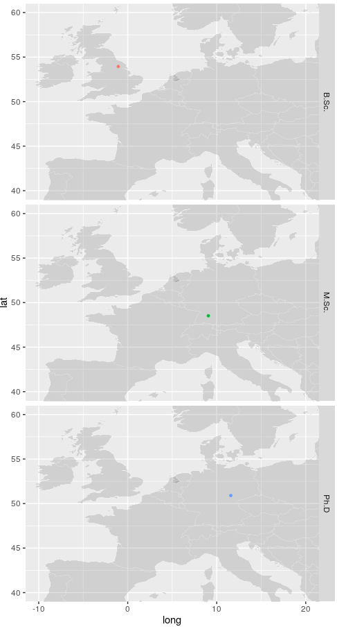
For this example, I will use the coordinates of the places I have previously studied in and save this as a .tsv (tab separated) file :
| City | Lat | Long | PeriodYork |
|---|---|---|---|
| York | 53.943540 | -1.061194 | B.Sc. |
| Tübingen | 48.518484 | 9.058082 | M.Sc. |
| Jena | 50.903443 | 50.903443 | Ph.D. |
I then ran the following R commands (in R v3.2.3):
##Load library ggplot2 (to install: install.packages("ggplot2"), and choose your closest server
library(ggplot2)
##Set your working directory
setwd("~/Downloads")
##Load the world map from within ggplot2 and remove antarctica
##(you can leave the removal of a country out, or add more countries with a list)
world <- map_data("world")
world <- world[world$region != "Antarctica",]

##Load your data
dat <- read.csv("city_coords.tsv", sep="\t", header=TRUE)

##Here you load your ggplot object into a variable
gg <- ggplot()

##Here you format your world map, line colour, object fill, and line size
##and transparency
gg <- gg + geom_map(data=world, map=world,
aes(x=long, y=lat, map_id=region),
color="white", fill="#7f7f7f", size=0.05, alpha=1/4)

##Here you apply your points you wish to project onto the map,
##in this case automatically coloured by another variable (Period).
##You can define the colours you wish of each period by adding
##+ scale_color_manual(values=c("#377eb8", "#984ea3", "#4daf4a"))
##after the geom_point close bracket. Each RGB colour represents the
##colour of each entry in the 'Period' column, in alphabetical order.
gg <- gg + geom_point(data=dat,
aes(x=Long, y=Lat, color=Period),
size=1)

##Here you can remove the legend, look into ggplot2's theme() variable
##to remove other things like tick marks etc.
gg <- gg + theme(legend.position="none")

##Here you can 'crop' your picture to a region you are interested in,
##and apply this in the decimal coordinate system as with your points.
##You will have to play around with this a lot depending on what you
##want to crop out, as how this displayed depends on your plot window size
##(draggable in R)
longlimits <- c(-10, 20)
latlimits <- c(40, 60)
gg <- gg + coord_cartesian(xlim = longlimits, ylim = latlimits)

#Open the final image, saying you want a column with each time period on
##each row. To make horizontal you switch the Period with the full stop.
gg + facet_grid(Period ~ .)

##Adapted from:
## https://www.r-bloggers.com/world-map-panel-plots-with-ggplot2-2-0-ggalt/
And you will get something like the following output (following some resizing of the window):
Once you’ve got the image you like, you can then save in a variety of formats by adding the R functions svg("my_map.svg", width=5, height=10) or png("my_map.png", width=50, height=100) prior the final command and putting dev.off() after the last command. The image should then be saved in your ‘working directory’ set at the beginning.
Based on that basic outline, you can look into the ggplot2 for further modifications (point shapes, colouring by certain continuous values etc.)